Target audience:
·
15 - 25
·
Has an interest
in the rock genre of music
·
Rebellious,
·
Working, drinking, going out – lack of
responsibility, it’s all about themselves, no dependents, lots of disposable
income
My target audience for my media
product would be people between the ages of fifteen and twenty five, they would
have a big interest in the rock genre of music, and they would be rebellious in
nature. They would have lots of disposable income, no dependents and have a
lack of responsibility. They would be attracted to my product because it will
offer everything the audience wants to read and find out about in one place,
creating the perfect reading material for them. They may be working which is
their only responsibility and this is what gives them their disposable income.
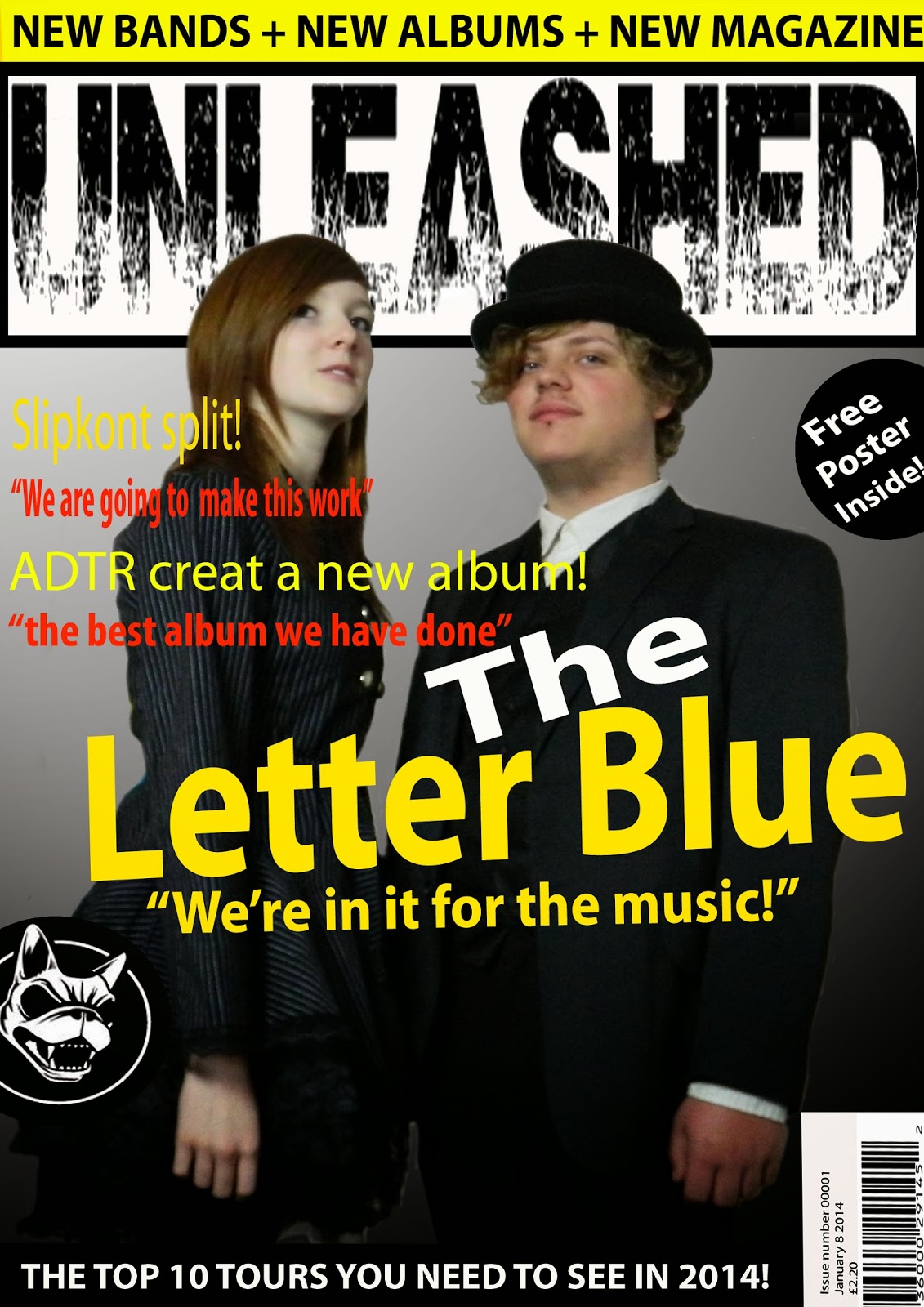
My Magazine represents a particular social group through
means of the content inside, as its genre is rock/metal music, it attracts its
audience through use of dark but bold colours and the way the writing is placed
is very much eye catching and stands out as it is unusual and of centre, this
is apparent on the my front cover as the title is slightly tilted making it
catch the attention of people walking past at is looks strange and peculiar.
The clothing of the people on the front cover also represents my intended
social group because again the clothing very dark and abnormal due to the
formalness of the clothing on an informal magazine. All these things put
together attracts my intended audience as they can relate to the terminology of
the magazine, the look given off by the photos and they want to know about the
content and information inside the magazine as it interests and informs them
about the world of rock and metal music.
Looking back at my preliminary task I have learnt how to
correctly position and scale the lettering. How to correctly colour code the
magazine so it’s aesthetically pleasing to the audience. I have learnt how to
organise the information properly so it’s clear but not to big that it covers
the main feature. I feel I also learnt how to properly use the Masthead in
order so it is readable and pleasing to look at, also I have learnt how to use
font correctly so it fits with the genre of the magazine but also looks good.
Layers were a big part of my learning curve as I grasped how to use them
correctly and effectively, likewise moving the main image a layer higher than
the background and title as well as the Masthead, making it stand out far
better, making it have eye contact with the audience and as it’s not the
background as theme can run through the magazine.